
Exploratory Data Analysis of Dog Walks
Published:
Background
We adopted our dog, Vera, in 2017. She is a rescue whose first 1.5 years were in a bad home (animal hoarder), so she had/has behavioral issues. Like some rescue dogs, she was more nervous/scared around men than women, and I was commuting long distances, so my girlfriend spent the most time with her for the first 6 months or so. So when Vera eventually started going on walks with me alone (when my girlfriend was gone), I decided to log these occurrences. I started doing so with more consistency when I moved to Boston in late 2020, and have continued to the present day. Although frustrating, this could be considered a “natural experiment” in that I can determine if some factors are related to whether she decides to go on a walk with me. So I have a small dataset to do some light exploratory data analysis. There wasn’t much to record, but I tried to write down the date, time, walk duration, temperature, and some general weather information (e.g., whether it was sunny, cloudy, raining, etc.).
 My dog Vera.
Setup and Import
I will mostly be using the data.table package (and its IDateTime related functions) for cleaning/wrangling, and lattice for visualizations.[1] So I first load the necessary packages and set some default options for lattice.
pacman::p_load(data.table, lattice, latticeExtra)
mysettings <- trellis.par.get()
mysettings$strip.background$col <- 'lightgrey'
mysettings$box.rectangle$col <- mysettings$box.umbrella$col <- 'black'
mysettings$plot.symbol$col <- 'black'
mysettings$plot.symbol$pch <- mysettings$superpose.symbol$pch <- 16
mysettings$plot.line$col <- 'black'
trellis.par.set(mysettings)

# Some character strings for plot labels
lab_duration <- 'Duration (min)'
lab_walk_time <- 'Walk time (HH:MM)'
lab_temp <- expression(Temperature~(degree*F))
Next, I’ll import the data and do some data cleaning/wrangling. One thing I’ll do is add an indicator variable (which I will call walk) denoting that a walk occurred; this is because later I will fill in rows for the dates in which a walk did not occur. I’ll also need to convert the Date and walk_time variables to the proper data types. Finally, we moved apartments in 2023 so that is another factor affecting walk occurrence/frequency.
walks <- fread('../../notes/vera_walks.csv',
               colClasses=c(Date='Date', walk_time='character'),
               drop=c('no1', 'no2'))
walks[, walk := 1L]
walks[, walk_time := paste(substr(walk_time, 1L, 2L), substr(walk_time, 3L, 4L), sep=':')]
walks[, DateTime := as.POSIXct(paste(Date, walk_time))]
walks[, walk_time_mins := difftime(DateTime, as.POSIXct(paste(Date, '00:00:00')), units='min')]
walks[, location := factor(ifelse(year(Date) >= 2023, 'Suburb', 'Boston'))]

# Hack to plot on a common axis scale
walks[, DateMD := as.Date(strftime(Date, format='%m-%d'), format='%m-%d')]
Initial exploration
Simple daily occurrence
The most basic plot I’ll look at is a general overview plotting the days on which a walk occurred. There will be a small vertical line segment for the days on which a walk occurred.
x1.at <- as.Date(c('2023-01-01', '2023-04-01', '2023-07-01', '2023-10-01', '2024-01-01'))
x2.at <- x1.at[-length(x1.at)] + 45L
xyplot(walk ~ DateMD | as.character(year(Date)), data=walks,
       as.table=TRUE, layout=c(1, 4), lwd=0.5, ylim=c(0.8, 1.2),
       xlab='Date', ylab=NULL, main='Daily occurrence of walks',
       scales=list(x=list(tck=c(1, 0)), y=list(at=NULL)),
       panel=function(x0, x1, y0, y1, ..., subscripts) {
         panel.abline(v=x1.at, col='lightgrey')
         panel.abline(v=x2.at, col='lightgrey', alpha=0.4)
         panel.segments(x0=x0[subscripts], y0=y0, x1=x1[subscripts], y1=y1, ...)
       },
       x0=walks$DateMD, x1=walks$DateMD, y0=0.95, y1=1.05)
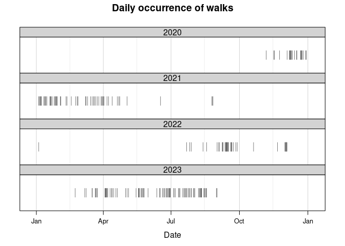
While there are many days in which no walks occurred, some of them are expected. In general, nearly all the walks should have occurred on a weekday; however, as my girlfriend is a medical resident she does work some weekends. This is clearly the case as seen in the following code block.
I can also summarize the number of walks the month and the week number. And, just for fun, I can look at walks by season (technically, “meteorological seasons”). But perhaps a bit more sensible than seasons would be quarters; to calculate those, I use base::quarters.
# Total number of walks for each weekday
table(walks[, factor(wday(Date), labels=day_names)])
##
##    Sunday    Monday   Tuesday Wednesday  Thursday    Friday  Saturday
##         3        31        35        40        45        42        10
# Total number of walks for each month
addmargins(walks[, table(year(Date), factor(month(Date), labels=month.abb))], 1L)
##
##        Jan Feb Mar Apr May Jun Jul Aug Sep Oct Nov Dec
##   2020   0   0   0   0   0   0   0   0   0   0   4  19
##   2021  22   8  13   8   1   1   0   3   0   0   0   0
##   2022   1   0   0   0   0   0   3   2  23   1   1   7
##   2023   0   1   8  13  14  18  19  15   1   0   0   0
##   Sum   23   9  21  21  15  19  22  20  24   1   5  26
# Total number of walks for each season
addmargins(walks[, table(year(Date), season(Date))], margin=1L)
##
##        Spring Summer Fall Winter
##   2020      0      0    4     19
##   2021     22      4    0     30
##   2022      0      5   25      8
##   2023     35     52    1      1
##   Sum      57     61   30     58
# Number of walks by quarter and year
addmargins(walks[, table(year(Date), quarters(Date))], margin=1L)
##
##        Q1 Q2 Q3 Q4
##   2020  0  0  0 23
##   2021 43 10  3  0
##   2022  1  0 28  9
##   2023  9 45 35  0
##   Sum  53 55 66 32
Walk time of day
I would also like to find the most common time of day a walk occurred. I’ll later use this when filling in missing values using historical weather data, as well as looking at a couple simple models. First, I want to look at the range of the data. One thing I noticed is that very few walks occurred outside of 0800 – 2000 (i.e., 8 AM to 8 PM), so I will limit the range.
# Number of walks outside of 8 AM - 8 PM
time_range <- walks[, between(walk_time_mins, 480, 1200)]
walks[!time_range, .N]
## [1] 5
summ <- walks[time_range, summary(as.numeric(walk_time_mins))]
summ <- sprintf('%02d:%02d', summ %/% 60, round(summ %% 60))
names(summ) <- c('Min.', '1st Qu.', 'Median', 'Mean', '3rd Qu.', 'Max.')
summ
##    Min. 1st Qu.  Median    Mean 3rd Qu.    Max.
## "08:00" "11:15" "14:45" "14:03" "16:45" "19:45"
x.at <- sprintf('%02d:%02d', seq(600, 1200, by=200) %/% 60, seq(600, 1200, by=200) %% 60)
walks[time_range,
      densityplot(~ as.numeric(walk_time_mins), from=450, to=1260,
                  scales=list(x=list(tck=c(1, 0), labels=c('', '', x.at)), y=list(tck=c(1, 0))),
                  main='Distribution of walk time of day', xlab=lab_walk_time, type=c('g', 'p'))]
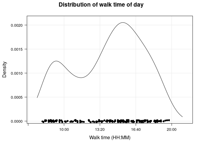
There appear to be two peaks, a smaller one between 0800 and 1000, and a larger one between 1400 and 1600 (closer to 1600). I’ll use the function pastecs::turnpoints to find the exact locations of the “turning points” (maxima and minima).
d <- walks[, density(as.numeric(walk_time_mins), from=480, to=1200)]
tp <- round(d$x[pastecs::turnpoints(ts(d$y))$tppos])
(tp_char <- sprintf('%02d:%02d', tp %/% 60, tp %% 60))
## [1] "09:16" "11:33" "15:29"
So the larger peak occurs at 15:29 and the smaller peak is at 09:16.
Although I will use this peak later, I am more interested in the most common times for a walk in our current apartment. Using essentially the same code, I find that there are again two peaks: the smaller one is at 09:29 and the larger one at 17:15.
Walk duration
I’ll look at some basic descriptive statistics for walk duration next. First, I’m interested in the overall distribution, which I will visualize as both a kernel density estimate plot and the empirical cumulative distribution function (eCDF) plot.
probs <- c(.25, .5, .75)
quants <- round(quantile(ecdf(walks$duration), probs=probs), 1L)
p_ecdf <- ecdfplot(~ duration, walks, scales=list(x=list(tck=c(1, 0)), y=list(rot=0)),
           xlab=lab_duration, ylab='Density and eCDF', main='Walk duration distribution',
           panel=function(x, ...) {
             panel.grid(h=0, v=-1, col='lightgrey')
             panel.ecdfplot(x, ...)
             panel.segments(x0=0, y0=probs, x1=quants, y1=probs, lty=2, col='red')
             panel.segments(x0=quants, y0=probs, x1=quants, y1=0, lty=2, col='red')
             panel.text(5, probs, names(quants), col='red', pos=3, cex=0.8)
             panel.text(quants, 0.05, as.character(quants), col='red', pos=4, cex=0.8)
           })
p_dens <- densityplot(~ duration, walks, type=c('g', 'p'), from=0, to=120,
              xlim=p_ecdf$x.limits, scales=list(x=list(tck=c(1, 0)), y=list(rot=0)),
              panel=function(x, ...) {
                panel.abline(v=mean(x, na.rm=T), lty=2, col='red')
                panel.densityplot(x, ...)})
c(p_ecdf, p_dens, layout=c(1, 2))
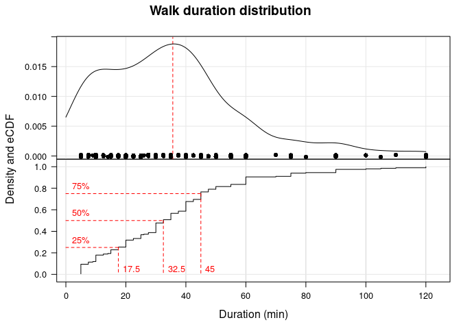
From the density and eCDF, it appears that the distribution may be slightly right or positively skewed (though not quite). Most of the data are 45 minutes or less, although some (~ 10%) are 1 hour or longer.
Walk duration by year
knitr::kable(walks[, summBy(duration, na.rm=TRUE), by=year(Date)],
             caption='Walk duration (in minutes) by year.', digits=1L)
| year | N | Min. | 1st Qu. | Median | Mean | 3rd Qu. | Max. | NA’s |
|---|---|---|---|---|---|---|---|---|
| 2020 | 23 | 5 | 5.0 | 27.5 | 38.5 | 60 | 100 | 3 |
| 2021 | 56 | 5 | 10.0 | 20.0 | 41.1 | 75 | 120 | 2 |
| 2022 | 38 | 5 | 30.6 | 41.2 | 37.6 | 45 | 55 | 0 |
| 2023 | 89 | 5 | 20.0 | 30.0 | 30.9 | 40 | 70 | 0 |
Walk duration (in minutes) by year.
I plot the kernel density estimates of duration by year, with a vertical line indicating the median duration (in minutes) for each year:
walks[!is.na(duration),
      densityplot(~ duration | as.character(year(Date)),
            as.table=TRUE, layout=c(1, 4), xlim=extendrange(duration),
            scales=list(x=list(tck=c(1, 0))), xlab=lab_duration, main='Walk duration by year',
            panel=function(x, ...) {
              panel.grid(h=-1, v=-1)
              panel.densityplot(x, darg=list(from=min(x), to=max(x)))
              panel.abline(v=mean(x))
            })]
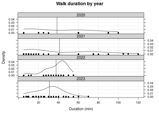
While the median duration is quite different for each year (see the above table), the mean duration is around 40 min for the first 3 years. Furthermore, all walks more than 100 minutes occurred in 2021. The mean in 2023 is around 30 minutes; this reflects the fact that I have been trying to limit how long our walks are due to discovering (in 2022) an old leg injury Vera had from a puppy.
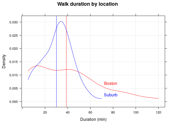
Walk duration by location
I plot the kernel density estimates of duration by location, with a vertical line indicating the median duration (in minutes) for each year:
| location | N | Min. | 1st Qu. | Median | Mean | 3rd Qu. | Max. | NA’s |
|---|---|---|---|---|---|---|---|---|
| Boston | 117 | 5 | 15 | 38.8 | 39.4 | 60 | 120 | 5 |
| Suburb | 89 | 5 | 20 | 30.0 | 30.9 | 40 | 70 | 0 |
Walk duration (in minutes) by location.
#key=list(title='Location', x=.75, y=.975, text=list(levels(walks$location)),
#         lines=list(col=c('red', 'blue')), cex=1.2, cex.title=1.0))
walks[!is.na(duration),
      densityplot(~ duration, groups=location,
            type='g', col=c('red', 'blue'), xlim=extendrange(duration),
            xlab=lab_duration, main='Walk duration by location',
            panel=panel.superpose,
            panel.groups=function(x, col.line, group.number, ...) {
              panel.densityplot(x, plot.points=FALSE,
                                darg=list(from=min(x), to=max(x)),
                                col=col.line)
              panel.abline(v=median(x), col=col.line)
              d <- density(x)
              panel.text(x=75, y=d$y[which(abs(d$x - 75) < .2)][1L],
                         labels=levels(walks$location)[group.number],
                         col=c('red', 'blue')[group.number], adj=c(0.25, -1.2))
            })]
Weather
Since at times it would seem that whether my dog would go for a walk was unpredictable, I tried to think of factors that could influence her. One of those factors I wondered about was the weather; was she more willing to go out when it was nice/sunny outside? Like many dogs, she doesn’t like the rain and is especially scared of thunderstorms. Looking at the first figure in this post – the daily occurrence of walks – we only went on walks a handful of times from Summer 2021 to the end of Summer 2022. Summer 2021 happened to be particularly rainy and cloudy in Boston, but Summer 2022 was generally better.
To see if there’s any difference that can be attributed to the weather, I’ll pull some historical weather data for the area. I manually downloaded data from the Iowa Environmental Mesonet, selecting the [BOS] BOSTON/LOGAN INTL weather station. The columns I’m interested in are:
valid: the date and time of the observationtmpf: air temperature (in Fahrenheit)p01i: precipitation (in inches) over the previous hourskyc1: “sky condition” or “cloud coverage”; there are several possible valuesCLR(clear): 0% – 5% cloud coverageFEW: 5% – 25% cloud coverageSCT(scattered): 25% – 50% cloud coverageBKN(broken): 50% – 87% cloud coverageOVC(overcast): 87% – 100% cloud coverageVV(vertical visibility); these are actually “unknown hits” which cannot definitively be classified as “cloud hits”
From the ASOS User’s Guide, Table 3 (in Chapter 4.1) explains the sky coverage values. Since I will only be creating a binary variable indicating “sunny” vs. “cloudy”, I will consider CLR and FEW to indicate “sunny”, and the others “cloudy”. (Including SCT as well would leave very few events indicating “cloudy” conditions.)
weather <- fread('../_data/BOS.csv', drop='station')
weather[, c('Date', 'obs_time') := tstrsplit(valid, split=' ')]
weather[, valid := as.POSIXct(valid)]
weather[, Date := as.Date(Date)]
Merging and filling in data
Now that I have historical data I will merge the tables, matching on the Date column. I will also add some missing data on days in which a walk occurred; in particular, I will fill in the temperature and sky condition.
# Merge the tables
walks_merged <- merge(weather, walks, by='Date',
                      all.x=TRUE, allow.cartesian=TRUE)

# Insert temp and sky condition where it was missing in the original table
inds <- walks_merged[, walk == 1 & abs(valid - DateTime) <= 30]
walks_merged[inds & is.na(temp), temp := tmpf]
walks_merged[inds & is.na(weather), weather := skyc1]

# Find the observation time nearest to the mode of the walk time distribution
tp_max <- as.numeric(sub(':', '', tp_char[3L]))
obs_times <- walks_merged[grep('54', obs_time), unique(obs_time)]
nearest <- obs_times[which.min(abs(as.numeric(sub(':', '', obs_times)) - tp_max))]
Next, I’ll insert data for the days in which a walk did not occur. I will use the observation time closest to the mode of the walk time distribution, which was 15:29. This observation time will be 15:54.
inds_na <- walks_merged[, is.na(walk) & obs_time == nearest]
walks_merged[inds_na, temp := tmpf]
walks_merged[inds_na, weather := skyc1]
walks_merged[inds_na, walk := 0]
Finally, I will filter the merged table so there will be 1 observation per day if no walk occurred, in addition to all observations for which a walk occurred. I’ll also set the correct location based on the date, as well as create a binary variable indicating whether it was sunny or cloudy. As mentioned above, for missing data I will consider CLR and FEW to mean it was sunny; otherwise, I will use the weather variable that I recorded myself.
# Create a new table with 1 row per day (and all walks)
walks2 <- walks_merged[walk == 0L | inds]
walks2[Date <= '2023-02-04' & is.na(location), location := 'Boston']
walks2[Date > '2023-02-04' & is.na(location), location := 'Suburb']

# Add new variable "sky"
walks2[grepl('sunny', weather) | weather %chin% c('CLR', 'FEW'), sky := 'sunny']
walks2[grepl('cloudy|drizzling|rain|snow', weather) | weather %chin% c('SCT', 'BKN', 'OVC'), sky := 'cloudy']
Weather-related summaries
Out of curiosity, I’ll look at some temperature-related summaries. First will be a summary of the temperature for all walks, and then temperature summaries by year.
walks2[walk == 1, summary(temp)]
##    Min. 1st Qu.  Median    Mean 3rd Qu.    Max.
##   20.00   40.00   55.00   56.33   72.50   90.00
knitr::kable(walks2[walk == 1, summBy(temp), by=year(Date)],
             caption='Temperature during walk by year.', digits=1L)
| year | N | Min. | 1st Qu. | Median | Mean | 3rd Qu. | Max. | NA’s |
|---|---|---|---|---|---|---|---|---|
| 2020 | 23 | 21.9 | 34.5 | 37.0 | 39.2 | 45.5 | 69 | 0 |
| 2021 | 56 | 20.0 | 35.0 | 40.0 | 45.7 | 54.2 | 90 | 0 |
| 2022 | 38 | 30.0 | 53.1 | 61.2 | 59.0 | 66.9 | 90 | 0 |
| 2023 | 86 | 40.0 | 53.1 | 70.0 | 66.7 | 80.0 | 90 | 0 |
Temperature during walk by year.
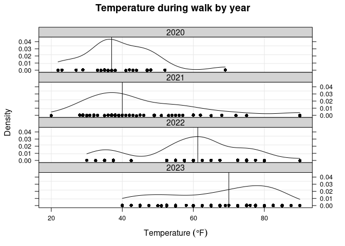
There is a pretty big difference between the means/medians across years, but it makes sense. The only data from 2020 are from November and December, so the range should mostly cover low temperatures. For 2021, most of the walks occurred in the first few months of the year, and again tended to be colder. In 2022, most walks occurred in the fall (with some in winter), which is why there is a peak around 60 degrees. And in 2023, most walks occurred in spring and summer, so there is a more even spread from moderate to hot temperatures.
I will also see how walk duration is related to temperature; I will visualize this using a scatterplot along with a smoothing spline. I expect there to be a “bell curve” relationship, since I tended to limit walk lengths for extreme temperatures. This generally appears to be the case (see the following figure), with most of the longest walks (more than 1 hour) taking place from around 40 – 60 degrees.
walks2[walk == 1,
       xyplot(duration ~ temp, type=c('p', 'g', 'spline'),
              scales=list(tck=c(1, 0)), xlab=lab_temp, ylab=lab_duration)]

I can also create temperature categories and look at duration statistics across these categories. I chose the temperature breakpoints somewhat randomly, but the “outer” categories are those in which it starts getting too cold or too hot to be outside for longer periods of time. I’ll also plot the kernel density estimates of duration for each category.
walks2[, tempCat := cut(temp, breaks=c(min(temp), 40, 55, 75, max(temp)), include.lowest=TRUE)]
knitr::kable(walks2[walk == 1, summBy(duration, na.rm=T), keyby=.(Temp=tempCat)],
             caption='Walk duration (min) by temperature category.', digits=1L)
| Temp | N | Min. | 1st Qu. | Median | Mean | 3rd Qu. | Max. | NA’s |
|---|---|---|---|---|---|---|---|---|
| [12.9,40] | 54 | 5.0 | 10.0 | 21.2 | 33.4 | 56.2 | 120 | 2 |
| (40,55] | 52 | 5.0 | 26.2 | 42.5 | 43.9 | 58.8 | 110 | 2 |
| (55,75] | 61 | 5.0 | 27.5 | 40.0 | 37.9 | 45.0 | 120 | 1 |
| (75,98] | 36 | 7.5 | 17.5 | 30.0 | 25.5 | 35.0 | 45 | 0 |
Walk duration (min) by temperature category.
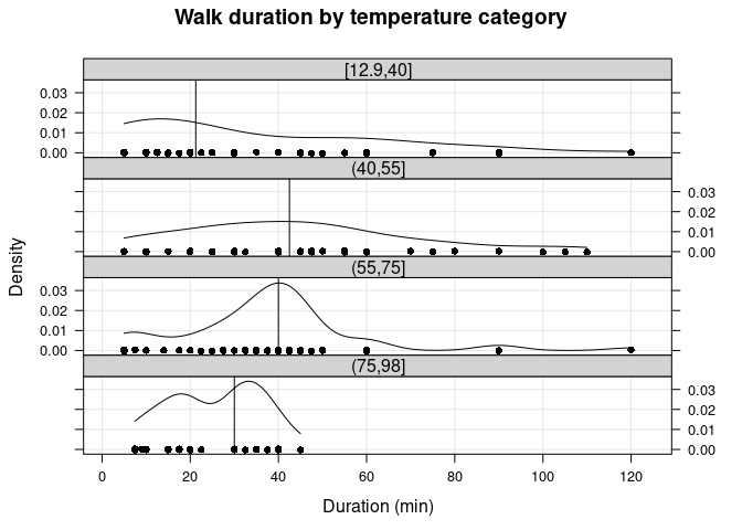
The table and plot above confirms that walk duration tended to be longest for “milder” temperatures.
Logistic regression modeling
Now I can run a couple logistic regression models.[2] Here, the outcome of interest is the binary variable walk. I can look at the effect of location (i.e., whether she was more likely to go on a walk in our new apartment), sky (whether she was more likely to go out when it was sunny), and tempCat (whether she was more likely to go out at specific temperatures). I expect a large effect of location, but I suspect there will be small (or no) effects of sky and tempCat. First I’ll need to exclude days from the final dataset.
Excluding data
In addition to most weekend days, there were other times in which a solo walk could not have occurred (e.g., vacation, at a dog sitter, sick). The longest explainable absence of data would be from mid-December 2022 until mid-February 2023; during this time period our dog was living elsewhere while we found a new place to move to.[3] I will also exclude weekend days (using the expression !wday(Date) %in% c(1L, 7L)), since I wouldn’t expect a (solo) walk to occur on most weekends. (A vector of excluded dates will be created using several calls to base::seq.Date.) So I will exclude these observations and call the resulting table walks_final (code not shown).
Model 1: effect of location
Running a logistic regression model is very simple in R. The first model I look at will be the effect of location on whether or not a walk occurred. There is only one predictor/independent variable, location, which is binary/dichotomous (“Boston” or “Suburb”). To be able to interpret the model coefficients, I’ll remove extra observations so that each row in the table is a single day. Before I run the model, I’ll look at the contingency table of these variables, and the odds ratio.
walks_final2 <- walks_final[, .SD[1], by=Date]
tab_location <- walks_final2[, table(walk, location)]
addmargins(tab_location, 1L)
##      location
## walk  Boston Suburb
##   0      441     60
##   1       98     68
##   Sum    539    128
# Odds and odds ratio
odds_location <- sweep(tab_location, 2L, tab_location[1L, ], '/', check.margin=FALSE)[-1L, ]
odds_ratio_loc <- odds_location[-1L] / odds_location[1L]
The odds is simply the ratio of success to failure for each location; when the odds are greater than 1, we were more likely to go out at that location. The odds ratio, which is 5.1, tells us that Vera is more than 5 times more likely to go on a walk with me in our current location relative to the previous apartment in Boston.
Now I’ll see if the logistic regression model gives the same result.
model_loc <- glm(walk ~ location, data=walks_final2, family='binomial')
(beta_loc <- coef(model_loc))
##    (Intercept) locationSuburb
##      -1.504077       1.629241
The variable beta_loc contains the parameter estimates for this model. The Intercept estimate is the log odds of a walk occurring at the “reference” location, which is Boston. The second estimate is the log odds ratio of a walk occurring at the second location relative to Boston. I will confirm that these are the same in the following code block:
all.equal(log(c(odds_location[1L], odds_ratio_loc)), beta_loc, check.attributes=F)
## [1] TRUE
Model 2: effect of “sky condition”
Since the previous section showed that a logistic regression with a single binary predictor doesn’t add any information (for the purposes of this dataset, at least), I will simply calculate the odds manually.
tab_sky <- walks_final2[, table(walk, sky)]
addmargins(tab_sky, 1L)
##      sky
## walk  cloudy sunny
##   0      194   304
##   1       78    88
##   Sum    272   392
# Odds and odds ratio
odds_sky <- sweep(tab_sky, 2L, tab_sky[1L, ], '/', check.margin=FALSE)[-1L, ]
(odds_ratio_sky <- odds_sky[-1L] / odds_sky[1L])
##    sunny
## 0.719973
Since the odds ratio for “sky condition” is less than 1, this means that Vera was less likely to go on a walk when it was sunny relative to when it was cloudy.
Model 3a: effect of temperature
Next, I’ll look at the effect of temperature (using the categorical variable tempCat). First, I will include tempCat as the only predictor.[4]
tab_temp <- walks_final2[, table(walk, tempCat)]
addmargins(tab_temp, 1L)
##      tempCat
## walk  [12.9,40] (40,55] (55,75] (75,98]
##   0          72     138     186     105
##   1          45      47      45      29
##   Sum       117     185     231     134
# Proportions for each temperature category
#array(c(tab_temp) / rep(colSums(tab_temp), each=2L), dim(tab_temp), dimnames(tab_temp))
sweep(tab_temp, 2L, STATS=colSums(tab_temp), FUN='/', check.margin=FALSE)
##     tempCat
## walk [12.9,40]   (40,55]   (55,75]   (75,98]
##    0 0.6153846 0.7459459 0.8051948 0.7835821
##    1 0.3846154 0.2540541 0.1948052 0.2164179
(odds_temp <- sweep(tab_temp, 2L, tab_temp[1L, ], '/', check.margin=FALSE)[-1L, ])
## [12.9,40]   (40,55]   (55,75]   (75,98]
## 0.6250000 0.3405797 0.2419355 0.2761905
Interestingly, the odds are highest for the coldest temperatures, and are pretty low across all temperatures. Given how frequently we’ve taken a walk this summer (when it’s been warmer) suggests to me that the temperature association should differ by location.
Model 3b: effect of temperature and location
Finally, I’ll add location along with interactions with tempCat.
tab_temp_loc <- walks_final2[, table(walk, tempCat, location)]
addmargins(tab_temp_loc, 1L)
## , , location = Boston
##
##      tempCat
## walk  [12.9,40] (40,55] (55,75] (75,98]
##   0          66     116     168      91
##   1          41      28      23       6
##   Sum       107     144     191      97
##
## , , location = Suburb
##
##      tempCat
## walk  [12.9,40] (40,55] (55,75] (75,98]
##   0           6      22      18      14
##   1           4      19      22      23
##   Sum        10      41      40      37
# Proportions for each temperature category, by location
prop.table(tab_temp_loc, 2L:3L)
## , , location = Boston
##
##     tempCat
## walk  [12.9,40]    (40,55]    (55,75]    (75,98]
##    0 0.61682243 0.80555556 0.87958115 0.93814433
##    1 0.38317757 0.19444444 0.12041885 0.06185567
##
## , , location = Suburb
##
##     tempCat
## walk  [12.9,40]    (40,55]    (55,75]    (75,98]
##    0 0.60000000 0.53658537 0.45000000 0.37837838
##    1 0.40000000 0.46341463 0.55000000 0.62162162
(odds_temp_loc <- apply(tab_temp_loc, 2L:3L, function(x) x[2L] / x[1L]))
##            location
## tempCat         Boston    Suburb
##   [12.9,40] 0.62121212 0.6666667
##   (40,55]   0.24137931 0.8636364
##   (55,75]   0.13690476 1.2222222
##   (75,98]   0.06593407 1.6428571
The output of the above code block generally confirms my suspicion. In the current location (“Suburb”), the odds of going on a walk increase with temperature, while in Boston it is the opposite.
mod_temp_loc <- glm(walk ~ tempCat * location, data=walks_final2, family='binomial')
coeffs_temp_loc <- cbind(summary(mod_temp_loc)$coef, confint(mod_temp_loc))
round(coeffs_temp_loc, 2L)
##                               Estimate Std. Error z value Pr(>|z|) 2.5 %
## (Intercept)                      -0.48       0.20   -2.39     0.02 -0.87
## tempCat(40,55]                   -0.95       0.29   -3.26     0.00 -1.52
## tempCat(55,75]                   -1.51       0.30   -5.07     0.00 -2.11
## tempCat(75,98]                   -2.24       0.47   -4.81     0.00 -3.25
## locationSuburb                    0.07       0.68    0.10     0.92 -1.34
## tempCat(40,55]:locationSuburb     1.20       0.77    1.56     0.12 -0.30
## tempCat(55,75]:locationSuburb     2.12       0.78    2.72     0.01  0.61
## tempCat(75,98]:locationSuburb     3.14       0.87    3.63     0.00  1.48
##                               97.5 %
## (Intercept)                    -0.09
## tempCat(40,55]                 -0.38
## tempCat(55,75]                 -0.94
## tempCat(75,98]                 -1.40
## locationSuburb                  1.38
## tempCat(40,55]:locationSuburb   2.79
## tempCat(55,75]:locationSuburb   3.71
## tempCat(75,98]:locationSuburb   4.92
Although not particularly illuminating, I can view the model’s parameter estimates along with the 95% confidence intervals. (I am mainly doing so for practice.)
DT <- as.data.table(coeffs_temp_loc, keep.rownames='term')
setnames(DT, c('2.5 %', '97.5 %'), c('lower', 'upper'))
DT[, dotplot(factor(term, levels=rev(term)) ~ Estimate,
             col=trellis.par.get('superpose.symbol')$col[1L],
             main='Model coefficients and 95% CI',
             sub=deparse(formula(mod_temp_loc)),
             panel=function(x, y, ...) {
               panel.segments(x0=lower, y0=y, x1=upper, y1=y, lwd=2, ...)
               panel.dotplot(x, y, ...)
               panel.abline(v=0, col='grey', alpha=0.5)
             },
             xlim=extendrange(c(lower, upper)))]

The (Intercept) term represent the log odds of a walk occurring for the reference values of both factors; this means when location = 'Boston' and temp = [12.9, 40] (the coldest temperatures) – we can call this the “baseline”. The next three are the log odds ratios for those temperature categories in Boston, and locationSuburb is the log odds when location = 'Suburb' and temp = [12.9, 40]; all ratios are relative to the baseline. The interaction terms are much more difficult to interpret, so the odds should be inspected for each category combination (shown above). From the following ANOVA table and likelihood ratio test, though, it seems that all terms are statistically significant.
anova(mod_temp_loc, test='LRT')
## Analysis of Deviance Table
##
## Model: binomial, link: logit
##
## Response: walk
##
## Terms added sequentially (first to last)
##
##
##                  Df Deviance Resid. Df Resid. Dev  Pr(>Chi)
## NULL                               666     748.50
## tempCat           3   15.092       663     733.41 0.0017398 **
## location          1   72.006       662     661.40 < 2.2e-16 ***
## tempCat:location  3   17.385       659     644.02 0.0005888 ***
## ---
## Signif. codes:  0 '***' 0.001 '**' 0.01 '*' 0.05 '.' 0.1 ' ' 1
Conclusions
There are a few conclusions I can make based on the data; the first is the clearest and most important.
- There is a significant effect of location on whether Vera goes on a walk with me. In fact, the odds are more than 5 times as high in the new apartment relative to the old. This confirms what I had suspected: that something about the previous apartment was triggering her fear, leading her refusing to go on walks alone with me.
- There are a couple “peak” times in which Vera is most likely to go for a walk: one in the morning, and one in the evening. This information could be useful to help plan my days.
- There doesn’t seem to be an effect on whether it is sunny or “gloomy” outside. She does refuse walks when it is actively raining, though.
- In terms of temperature, overall she was slightly more likely to go outside when it was cool/cold (< 55 degrees) compared to when it was hot. However, this is not the case in the new apartment, likely because there is not enough data for colder days yet.
Session Info
## R version 3.6.0 (2019-04-26)
## Platform: x86_64-redhat-linux-gnu (64-bit)
## Running under: CentOS Linux 7 (Core)
##
## Matrix products: default
## BLAS/LAPACK: /usr/lib64/R/lib/libRblas.so
##
## locale:
##  [1] LC_CTYPE=en_US.UTF-8       LC_NUMERIC=C
##  [3] LC_TIME=en_US.UTF-8        LC_COLLATE=en_US.UTF-8
##  [5] LC_MONETARY=en_US.UTF-8    LC_MESSAGES=en_US.UTF-8
##  [7] LC_PAPER=en_US.UTF-8       LC_NAME=C
##  [9] LC_ADDRESS=C               LC_TELEPHONE=C
## [11] LC_MEASUREMENT=en_US.UTF-8 LC_IDENTIFICATION=C
##
## attached base packages:
## [1] stats     graphics  grDevices utils     datasets  grid      methods
## [8] base
##
## other attached packages:
##  [1] rmarkdown_1.16       nvimcom_0.9-83       microbenchmark_1.4-7
##  [4] latticeExtra_0.6-28  RColorBrewer_1.1-2   lattice_0.20-41
##  [7] gridExtra_2.3        data.table_1.12.6    setwidth_1.0-4
## [10] pacman_0.5.1         colorout_1.2-2
##
## loaded via a namespace (and not attached):
##  [1] Rcpp_1.0.11     knitr_1.25      magrittr_1.5    MASS_7.3-51.4
##  [5] here_1.0.1      rlang_0.4.10    highr_0.8       stringr_1.4.0
##  [9] pastecs_1.3.21  tools_3.6.0     gtable_0.3.0    xfun_0.19
## [13] htmltools_0.4.0 rprojroot_2.0.3 yaml_2.2.0      digest_0.6.22
## [17] evaluate_0.14   stringi_1.4.3   compiler_3.6.0  boot_1.3-23
I use
latticeinstead ofggplot2because there are many fewer dependencies and I’ve found it renders a lot faster; however, more complicated plots are generally easier withggplot2.This website has a lot of useful information on understanding odds ratios in logistic regression.
Due to her general and noise-related anxiety/phobia, our Boston apartment was not suitable, which is why we moved.
Since it is a bad idea to categorize continuous variables, I should include a quadratic term for
temp(using thepolyfunction), but this isn’t a serious analysis so perhaps I’ll leave that to another post.